Brand

The Halia brand.

Halia surfaces the quiet, high-value clients hiding in a brand's own data. The brand should feel the same way it works: calm, precise, and quietly premium. This page holds the mark, the colours, the type, and the voice.

The name

Halia.

Halia takes its name from Haliaeetus, the genus of the sea eagle. Sea eagles have among the sharpest eyesight in nature; they pick out the smallest movement from two miles up. That is exactly what the product does: it sees the high-value client others miss, in data a brand already holds. The tone follows from that, precise, far-seeing, and quietly sure of itself.

Always written Halia, capital H, never in all caps, never abbreviated.

The mark

An asterism.

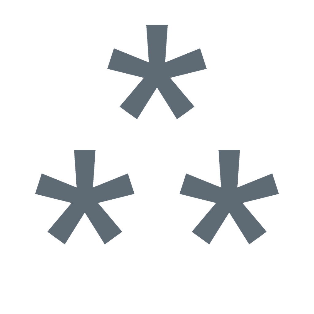
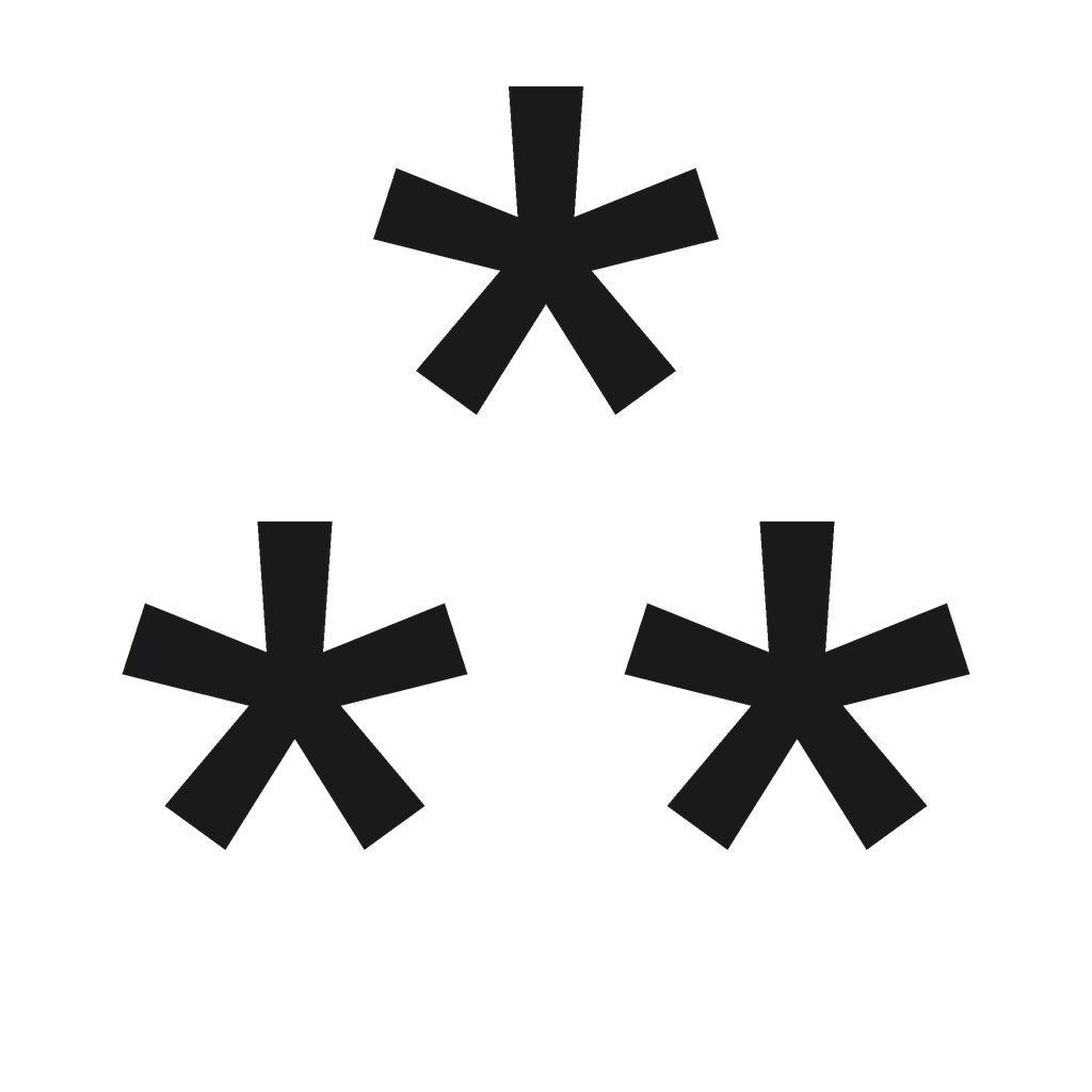
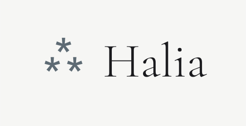
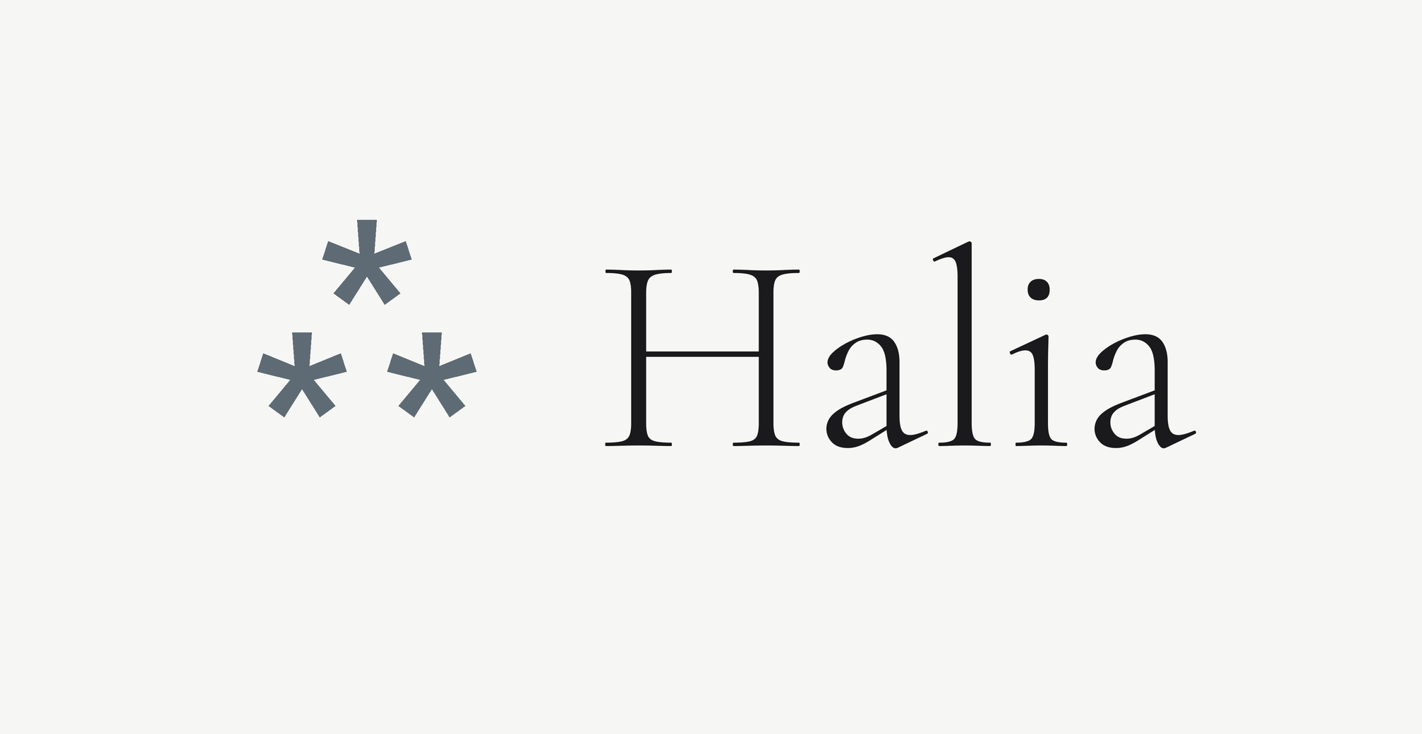
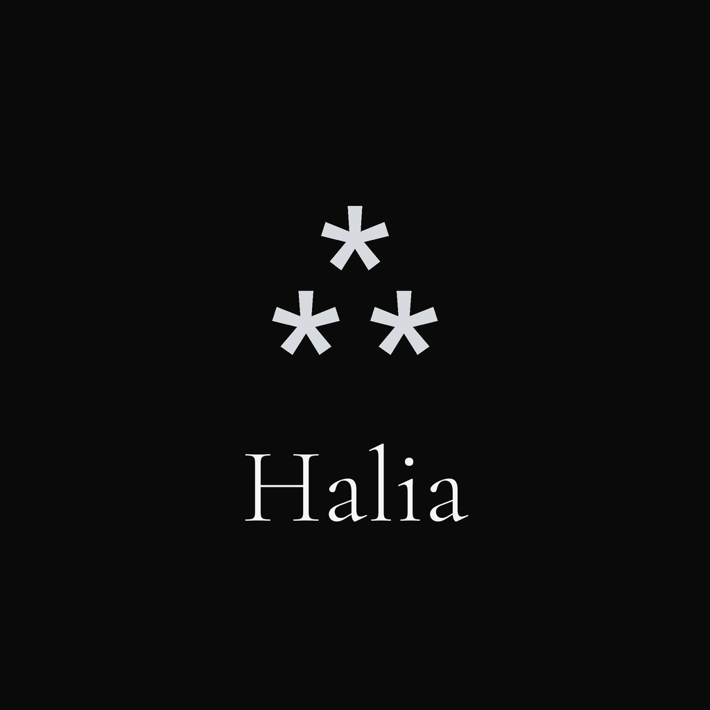
The Halia mark is an asterism: three asterisks set in a triangle, an old typographic mark used to draw the eye and set a passage apart. It is quieter and rarer than a single star, and it nods to print and editorial craft. It pairs with the Halia wordmark in Cormorant Garamond, or stands alone as an icon.

Asterism · U+2042 · set in Cormorant Garamond Download mark (SVG)
Lockups

Horizontal.

The primary lockup sets the mark to the left of the wordmark, both in Cormorant Garamond, weight 300. Use the cream version by default and the reversed version on near-black.

Halia
Primary · on cream
Halia
Reversed · on near-black
Square

App icons & stacked wordmarks.

For avatars, app icons, and social, use a square. The mark sits alone as an icon, or above the wordmark as a stacked lockup. Keep generous, even padding on every side.

Halia
Halia
Icon · ink
Icon · slate
Stacked · cream
Stacked · dark
Do
  • Give the mark clear space of at least its own height on every side.
  • Use the cream, near-black, ink, or slate versions only.
  • Keep the wordmark in Cormorant Garamond, weight 300.
  • Let it sit small and confident; it does not need to shout.
Do not
  • Recolour the mark or add gradients, shadows, or outlines.
  • Swap the asterism for a star or another ornament.
  • Set the wordmark in another typeface or in all caps.
  • Place it on a busy image without a calm, solid panel behind it.
Colour

Off-white, ink, and a cool slate.

An editorial palette. Off-white and ink do the work; the slate is an accent, used sparingly for emphasis and the mark. Near-black carries the rare dramatic, full-bleed moment.

Off-white
#F6F6F4
Ink
#1a1a1d
Slate (accent)
#5E6B74
Silver (light)
#D7DADE
Near-black
#0A0A0B
Muted
#5c5c61
Typography

A serif for the idea, a sans for the detail.

Cormorant Garamond carries the headlines, the wordmark, and the brand voice, light and a little literary. Hanken Grotesk handles everything functional: labels, body, numbers, the interface.

Display · Cormorant Garamond · Light 300
Your best clients are already here.
Aa Bb Cc Dd Ee   1925
HeadlinesStatementsThe wordmark
Text · Hanken Grotesk · 400 / 500 / 600
A clear read on every customer.

Hanken Grotesk keeps the product legible and calm. Use 400 for body, 500 for labels and buttons, 600 only where a number or a heading needs to hold its ground.

BodyLabelsButtonsTables & numbers
Voice

Calm, plain, and quietly optimistic.

Halia speaks like a trusted advisor: precise without being technical, warm without being soft, calm about real money. The reader should feel that real value, already theirs, is about to be found.

  • Plain over clever. Say the useful thing simply.
  • Show the evidence. Name the signal, the score, the number.
  • Lead with the client's gain. The mechanics come second.
  • Reassure on privacy in our own words: scoring runs in memory and finishes there; your data stays yours.
  • Calm, understated, and quietly confident in tone.
  • No jargon where a plain word will do.
  • Never imply we see other brands' data, or learn from yours.
  • No em dashes. Use a comma, a colon, or a full stop.
  • Say what Halia is. Write the positive statement; skip the "X, not Y" and "no X, no Y" constructions.
Press & brand

Need something else?

For logos in other formats, a press note, or a question about using the Halia brand, get in touch.

Contact us